Current Events > GameFAQs 2nd Beta Beta
| Topic List | |
|---|---|
|
pokedude900 07/08/21 5:27:24 PM #251: |
PatrickMahomes posted...
There are a lot, actually. Especially with older games that share their titles with reboots. And not remakes, mind you, but actual completely different games that happen to have the same name. --- https://imgur.com/Kh0QBLz https://imgur.com/hOhxEtg Come to the (un)official GameFAQs Touhou board. http://www.gamefaqs.com/boards/1110- ... Copied to Clipboard!
|
|
PatrickMahomes 07/08/21 5:33:36 PM #252: |
pokedude900 posted...
There are a lot, actually. Especially with older games that share their titles with reboots. And not remakes, mind you, but actual completely different games that happen to have the same name.A completely new title with the same name is neither a reboot or a remake then. --- NFLB 2021 Summersim mk.2 Roster (0-4): https://imgur.com/o8IeFJS https://imgur.com/cEQy3f4 / https://imgur.com/gWKaLHC ... Copied to Clipboard!
|
|
jon davis 07/08/21 5:56:06 PM #253: |
Gamefaqs has a reputation on the internet as being a hive of trolls and fanboys, with lax rules that allow them to run wild.
No amount of fresh paint and board merging is going to fix that. --- Strength is the only thing that matters in this world, everything else is just a delusion for the weak. ... Copied to Clipboard!
|
|
LRodC 07/08/21 6:01:30 PM #254: |
Notifications for replies to users topics dont go directly to the reply like it used to.
... Copied to Clipboard!
|
|
divot1338 07/08/21 6:01:56 PM #255: |
If SBallen was better at self promotion hed have called this a Better Beta
--- Moustache twirling villian https://i.imgur.com/U3lt3H4.jpg- Kerbey ... Copied to Clipboard!
|
|
PMarth2002 07/08/21 6:04:54 PM #256: |
I'd prefer the boards stay the same, but here's a bit of feedback on some stuff that stands out to me.
The game information stuff on the side takes up too much screen real estate. It should be about the size of a wikipedia sidebar. Tags on users don't stand out like the current tags do. A contrasting color makes them more noticeable. -The italic topic titles for topics with new posts are really annoying and difficult to read when mixed in with normal (unread) topics. I would consider a different formatting entirely (I know that some other websites use bold for new posts, but I'm not a fan of that either; perhaps normal text but a more noticeable icon in place of the blue dot) ^ Agreed with that. Italics is obnoxious to read. At least give an option to turn it off. --- They have taken untold millions that they never toiled to earn But without our brain and muscle not a single wheel can turn ... Copied to Clipboard!
|
|
badjay 07/08/21 7:37:05 PM #257: |
 Please fix the spacing at the end of every post. I mentioned this before too, I don't know why there's an extra line of space at the end of someone's post and a signature (although the signature space has existed before beta). Please make sure the report and quote buttons are blue in other style sheets, although that's something you guys are probably working on. Also fix the awkward as hell heart symbol/favorites button at the upper right of the board. It's really weird seeing it out there all alone. I didn't circle it, but there's a weird white line between user names on the LEFT side, it's pretty obvious when you compare the original to beta. Can that go away too?  Here's a comparison pic so you guys have a better idea. I'm fine with the beta the aesthetics are significantly better than the previous eye cancer of before. Hope this helps out. Edit: I also noticed you guys put the post info back. Thanks I wonder how many people complained about that? I put a formal request to have that added back in the forms. --- [05:45:34] I bought an American L and it was like a tent ... Copied to Clipboard!
|
|
BarbaricAvatar 07/08/21 7:44:55 PM #258: |
Will there eventually be more sorting options on system pages for games?
For example: https://gamefaqs.gamespot.com/beta/game-boy-advance You select a genre but there's only sort by popularity and name at the moment. --- Habitual Judge ... Copied to Clipboard!
|
|
Kakapo 07/08/21 7:47:51 PM #259: |
Goatsensation posted...
Upvote system pleaseReddit already exusts --- Did my singing please you? No, the words you sang were wrong 24 hour party parrot ... Copied to Clipboard!
|
|
STEROLIZER 07/08/21 8:01:36 PM #260: |
My only feedback is to not moderate people for dhitting all over it.
I thought the first Beta was alright, but I mean, it's change... something good be a 100% improvement, and people will still bitch & moan because it's a very big change to something that's been apart of their lives for decades. So with that said, you should expect criticism, alot if which will be totally invalid and unwarranted. However, this is just humans acting as humans do. Complaining about the change should not be a moddable behavior, unless in doing so it becomes a major TOS violation. I somewhat observed some overly emmotional comments and potential backlash from the GameFaqs administration in response to the harsh criticism from the initial launch. My suggestion this time around would be to simply ignore all invalid criticism - as opposed to getting all hot and bothered, and possibly taking action to cull the FUD. --- ---./|,-``\(o)_\,----,,,_........................Love is like a bottle of gin ---( `\(o),,_/` : o : : :o `-,..............But a bottle of gin is not like love. ... Copied to Clipboard!
|
|
LRodC 07/08/21 8:06:17 PM #261: |
 This also sucks. The text is way too big, not centered properly, and honestly unnecessary. It seems like others already covered that, so Ill add on to it. Also, on that note, why are uploaded screenshots so compressed? ... Copied to Clipboard!
|
|
Goatsensation 07/08/21 9:05:28 PM #262: |
Whenever someone posts the system should roll a d20 to determine what happens. Worst case result they roll a one and the use is moderated for the post, if they roll a natural 20 they gain three karma and the post is highlighted for 5 minutes/an hour/a day.
--- Honour is dead, but I'll see what I can do. he/him ... Copied to Clipboard!
|
|
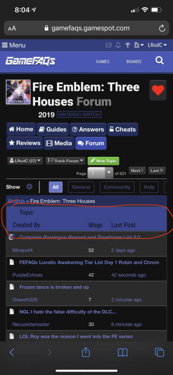
Aerodynamic Trunks 07/08/21 9:07:17 PM #263: |
LRodC posted...
not centered properlyIf you look at it, it tells you how the content in the table is laid out --- http://img82.imageshack.us/img82/2505/aerodynamictrunksty1.jpg - jazz is so awesome. ... Copied to Clipboard!
|
|
wackyteen 07/08/21 9:10:42 PM #264: |
Aerodynamic Trunks posted...
If you look at it, it tells you how the content in the table is laid outBut the fact it's Topic Created By And not Topic Created By Is the issue --- The name is wackyteen for a reason. Never doubt. ... Copied to Clipboard!
|
|
Aerodynamic Trunks 07/08/21 9:14:43 PM #265: |
wackyteen posted...
But the fact it'sFrom the example, look at how it's stacked  I don't see why it would be laid out differently in the header for the table than it is for the table content --- http://img82.imageshack.us/img82/2505/aerodynamictrunksty1.jpg - jazz is so awesome. ... Copied to Clipboard!
|
|
divot1338 07/08/21 9:19:54 PM #266: |
Aerodynamic Trunks posted...
From the example, look at how it's stackedWord wrap in a cell due to being displayed on a narrow screen. --- Moustache twirling villian https://i.imgur.com/U3lt3H4.jpg- Kerbey ... Copied to Clipboard!
|
|
wackyteen 07/08/21 9:20:34 PM #267: |
Aerodynamic Trunks posted...
From the example, look at how it's stackedIt just creates a very awkward looking, unappealing space across the entirety of the rest of the header. Logically, yeah, it makes a bit sense but from an initial impact, it just doesn't jive --- The name is wackyteen for a reason. Never doubt. ... Copied to Clipboard!
|
|
Aerodynamic Trunks 07/08/21 9:28:13 PM #268: |
divot1338 posted...
Word wrap in a cell due to being displayed on a narrow screen.Try it with short topic titles wackyteen posted... LogicallyThat's all I can deal in, I'm here for semantics and logic --- http://img82.imageshack.us/img82/2505/aerodynamictrunksty1.jpg - jazz is so awesome. ... Copied to Clipboard!
|
|
wackyteen 07/08/21 9:36:41 PM #269: |
Aerodynamic Trunks posted...
That's all I can deal in, I'm here for semantics and logicOn CE? You might be in the wrong place for the latter --- The name is wackyteen for a reason. Never doubt. ... Copied to Clipboard!
|
|
divot1338 07/08/21 9:40:38 PM #270: |
Aerodynamic Trunks posted...
Try it with short topic titlesYou assume that the text for that part occupies the entirety of that column for the header row which isnt guaranteed. Visually it appears to be word wrap. But Im not going to pore through something as tedious as html table layout for something that is just as likely to be hastily built html. In parlance you should be familiar with post your issue for sballen and move on. --- Moustache twirling villian https://i.imgur.com/U3lt3H4.jpg- Kerbey ... Copied to Clipboard!
|
|
ChocoboMogALT 07/08/21 9:43:48 PM #271: |
LRodC posted...
I had the same complaint about that bar. I like the color, but it's too large (on chrome android). --- "We live in a country Hasire.." ~ yosouf06 REVOLVER STAKE! http://img.photobucket.com/albums/v717/ChocoboMog123/AltEisenRChocoboMog.png ... Copied to Clipboard!
|
|
Jiggy101011 07/08/21 11:23:38 PM #272: |
 Either Error isn't a mod any longer or the beta just gets rid of the tag. @Error1355 --- XBL: F1RE v2 PSN: F1REx ... Copied to Clipboard!
|
|
Paragon21XX 07/08/21 11:31:50 PM #273: |
wackyteen posted...
But the fact it'sExcept there is no issue other than it is sloppily-designed on mobile: First line is referring to topic title Second line is who the topic is created by This fact is immediately evident if you were to hop onto the desktop version where it looks like this: Topic..................Created By "Topic title"........."Author" --- Hmm... ... Copied to Clipboard!
|
|
-Unowninator- 07/08/21 11:36:44 PM #274: |
Why aren't the top 10 board list or upcoming releases in the beta?
--- ''Think of what it would mean if we had a real president, not just somebody who plays one on TV.'' ~ Hillary Clinton Join the unknown: http://goo.gl/S75cmn ... Copied to Clipboard!
|
|
BeyondWalls 07/08/21 11:37:31 PM #275: |
ChocoboMogALT posted...
I had the same complaint about that bar. I like the color, but it's too large (on chrome android).Yeah, ditch the bar. --- END OF LINE ... Copied to Clipboard!
|
|
pokedude900 07/09/21 3:29:21 AM #276: |
I'm being completely serious here. Just scrap the modern style entirely and make classic the default. It has been explained many times by many people why modern is not only an eyesore, but also functionally hard to use for people with vision impairments.
And no, giving us the option to stay on classic isn't good enough. No matter how clear you make it that that option exists, the fact of the matter is most users aren't going to bother looking for it and just stick with the default layout. It's not going to do anything to attract new users to the site. In fact it'll drive them away. They'll take one look at how hideous the boards are and move right back to Reddit or their favorite Discord server. --- https://imgur.com/Kh0QBLz https://imgur.com/hOhxEtg Come to the (un)official GameFAQs Touhou board. http://www.gamefaqs.com/boards/1110- ... Copied to Clipboard!
|
|
PC-Builder_Pony 07/09/21 3:31:00 AM #277: |
We need the Pink/White and Pink/Black themes first
--- Mac Book Pro 16 - 6-Core i7-9750H @ 2.60GHz - 32gb DDR4 2667 MHz - Radeon Pro 5500M 8gb - 2TB Apple SSD ... Copied to Clipboard!
|
|
RiKuToTheMiGhtY 07/09/21 5:10:47 AM #278: |
Well its good to see that SBAllen is being more open and talking with users especially in this topic and answering questions people have about what and why for the changes.
--- doa-plus.com - We Press Forward. . . By Pressing Back. ... Copied to Clipboard!
|
| #279 | Post #279 was unavailable or deleted. |
|
BlingBling22947 07/09/21 6:10:05 AM #280: |
I just joined.
--- When was the last time you heard your boy Nas rhyme? Never on schedule but always on time ... Copied to Clipboard!
|
|
Aitz 07/09/21 6:42:52 AM #281: |
Okay, here is some feedback while I was surfing through the beta:
-Once I click on the spoiler tag, I cant hide it back. While it makes sense that once you see it, it becomes pointless to hide it anymore but I want to know if we will get the option to hide it again like the current version? -The upper part of a board where all the board options, pagination stuff is kinda clustered close to each other. The board options under blue boxes look unaligned to me and are also bigger. Maybe make them a bit smaller? -The Topic Created By box also looks big. If you could make it a bit smaller then that would be great. The thing is, big text and boxes on the phone becomes annoying to see. Thats one thing I didnt like about the beta you released a couple of weeks earlier. -The topic inside page looks good to me but the signature is looking bigger than the text in the post. Maybe make this smaller too -The options at the lower side like track topic, next page etc are glued to the last post above, some spacing would be needed. -Are you also thinking to remove the Hide and Sticky option in the OP? I hope not. -The way the tagged users were highlighted was good. In this beta though they look just as same as the TC tag and you tag. Would like if the tag is bold like before so that I can easily see who to ignore and who to reply Overall, the biggest issues I have here are things are larger than they should be. Like, one thing becomes more prominent than the other which is not the case in the current version. --- Fire Emblem Heroes: 1691818076 Target: Get all Celicas <3 at +10 Celica counts: OG! Celica +2 - F!Celica +1 - B!Celica x1 - L!Celica +10! ... Copied to Clipboard!
|
|
spikethedevil 07/09/21 6:44:49 AM #282: |
spikethedevil posted...
Good idea @SBAllen Noticed you didnt do it lol. --- A garbage pod!? It's a smegging garbage pod! ... Copied to Clipboard!
|
|
Aitz 07/09/21 6:49:18 AM #283: |
Also, I noticed something about the notification. Whenever there is a new post in a topic I made or tracked, it takes me to the first post of the topic instead of the latest one
--- Fire Emblem Heroes: 1691818076 Target: Get all Celicas <3 at +10 Celica counts: OG! Celica +2 - F!Celica +1 - B!Celica x1 - L!Celica +10! ... Copied to Clipboard!
|
|
Slayer_22 07/09/21 6:50:35 AM #284: |
Aitz posted...
Also, I noticed something about the notification. Whenever there is a new post in a topic I made or tracked, it takes me to the first post of the topic instead of the latest one That means you've been blocked my someone, usually lol --- "And no I'm not signing your twitter after this type of attitude so don't ask..." - IIINCORRUPTIBLE ... Copied to Clipboard!
|
|
ssj3vegeta_ 07/09/21 7:40:57 AM #285: |
spikethedevil posted...
He knows da gamefaqs community don't want it lol --- ... Copied to Clipboard!
|
|
Funkydog 07/09/21 7:45:16 AM #286: |
Slayer_22 posted...
That means you've been blocked my someone, usually lolOr someone you've ignored/blocked made the most recent post. --- ... Copied to Clipboard!
|
|
Aitz 07/09/21 1:47:32 PM #287: |
Slayer_22 posted...
That means you've been blocked my someone, usually lol Thats not the case though. I was still able to see the latest post and even quote on it. --- Fire Emblem Heroes: 1691818076 Target: Get all Celicas <3 at +10 Celica counts: OG! Celica +2 - F!Celica +1 - B!Celica x1 - L!Celica +10! ... Copied to Clipboard!
|
|
The-Apostle 07/09/21 4:42:08 PM #288: |
CapnMuffin posted...
but I like the option to have the classic forum style on.Where is the button? I can't find it. --- http://goo.gl/mnO36O #GoPackGo Not changing sig until NHL players are allowed to play in the Olympics. Started 2/22/2018 ... Copied to Clipboard!
|
|
BeyondWalls 07/09/21 4:46:28 PM #289: |
 New style for paid members looks great. --- END OF LINE ... Copied to Clipboard!
|
|
CapnMuffin 07/09/21 5:08:37 PM #290: |
The-Apostle posted...
Where is the button? I can't find it.  Hit that and then Display Style When in the other style, the option is found in the dropdown box by clicking your username ... Copied to Clipboard!
|
|
Dat_Cracka_Jax 07/09/21 5:48:55 PM #291: |
CapnMuffin posted...
What's this? I don't see that gear or where to do it under my username --- ... Copied to Clipboard!
|
|
CapnMuffin 07/09/21 5:57:58 PM #292: |
Make sure you opted into the beta. Then make sure youre on a *game* board and not a social/interest one.
... Copied to Clipboard!
|
|
jon davis 07/09/21 6:23:48 PM #293: |
BeyondWalls posted...
What? --- Strength is the only thing that matters in this world, everything else is just a delusion for the weak. ... Copied to Clipboard!
|
|
spikethedevil 07/09/21 6:32:23 PM #294: |
jon davis posted...
What? Its photoshopped. --- A garbage pod!? It's a smegging garbage pod! ... Copied to Clipboard!
|
|
Funkydog 07/09/21 6:47:44 PM #295: |
spikethedevil posted...
Its photoshopped.Yeah, the actual one has the "Current Events" in shiny gold. --- ... Copied to Clipboard!
|
|
BanthaBreed 07/09/21 6:57:45 PM #296: |
GFAQS sucks, kill it already.
... Copied to Clipboard!
|
| #297 | Post #297 was unavailable or deleted. |
|
ChocoboMogALT 07/11/21 3:33:35 PM #298: |
1. Can you add (Moderator) tags to mods?
2. This looks a bit goofy:  I like the big easy to click buttons, it's just inconsistent with the rest of the style. Maybe boxes instead of rounded edges or a different color? --- "We live in a country Hasire.." ~ yosouf06 REVOLVER STAKE! http://img.photobucket.com/albums/v717/ChocoboMog123/AltEisenRChocoboMog.png ... Copied to Clipboard!
|
|
spikethedevil 07/11/21 9:46:16 PM #299: |
Crash posted...
How come this didn't happen? No announcement or link on the home page. --- A garbage pod!? It's a smegging garbage pod! ... Copied to Clipboard!
|
|
E_S_M_Z 07/12/21 10:35:05 AM #300: |
It's driving me nuts in the beta that I can't clicked on a quoted message to see the actual message. Makes it much harder to track crazy arguments back to their source.
--- ()xxx[]:::::::::::::::::::::::::::::::::::::::::::::::::::::::::::::::::::::> Vanquisher of Gadonuts & The Ghost o' Quakecon Yet To Come ... Copied to Clipboard!
|
| Topic List |